New updates & improvements to Clarify.

Scatter plots are now available as a visualization type for boards! With scatter plots, you can visualize the correlation between multiple items. For example, in the screenshot above, we are plotting the temperature and power consumption of a building. In addition to x- and y-axis, the visualization lets you modify both the size and colur of each point based on item values.

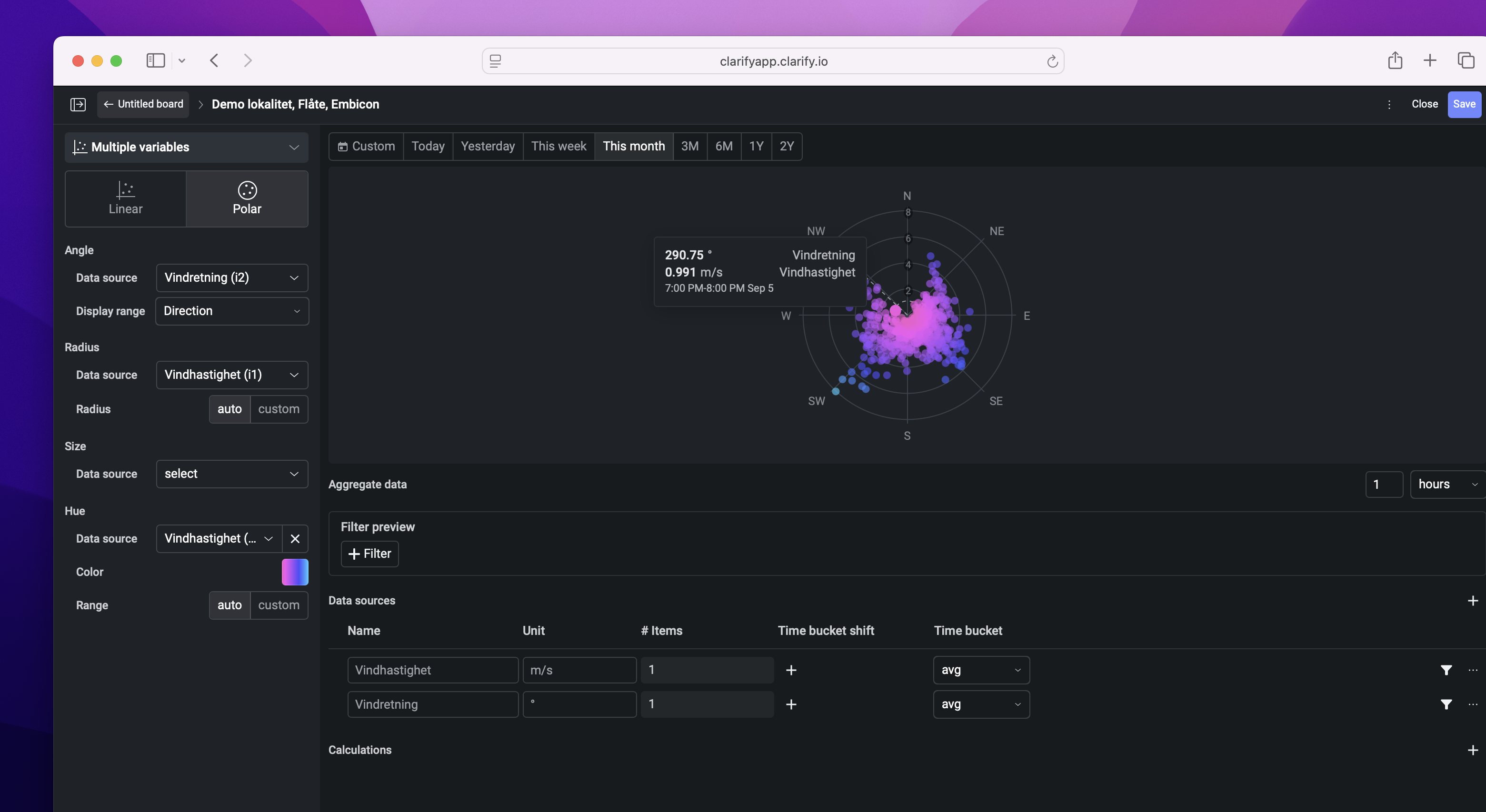
We also support visualizations in polar coordinates, allowing you to visualize for example the wind direction and strength in the same plot. Try it out in a board in your organization today!