New updates & improvements to Clarify.

Scatter plots are now available as a visualization type for boards! With scatter plots, you can visualize the correlation between multiple items. For example, in the screenshot above, we are plotting the temperature and power consumption of a building. In addition to x- and y-axis, the visualization lets you modify both the size and colur of each point based on item values.

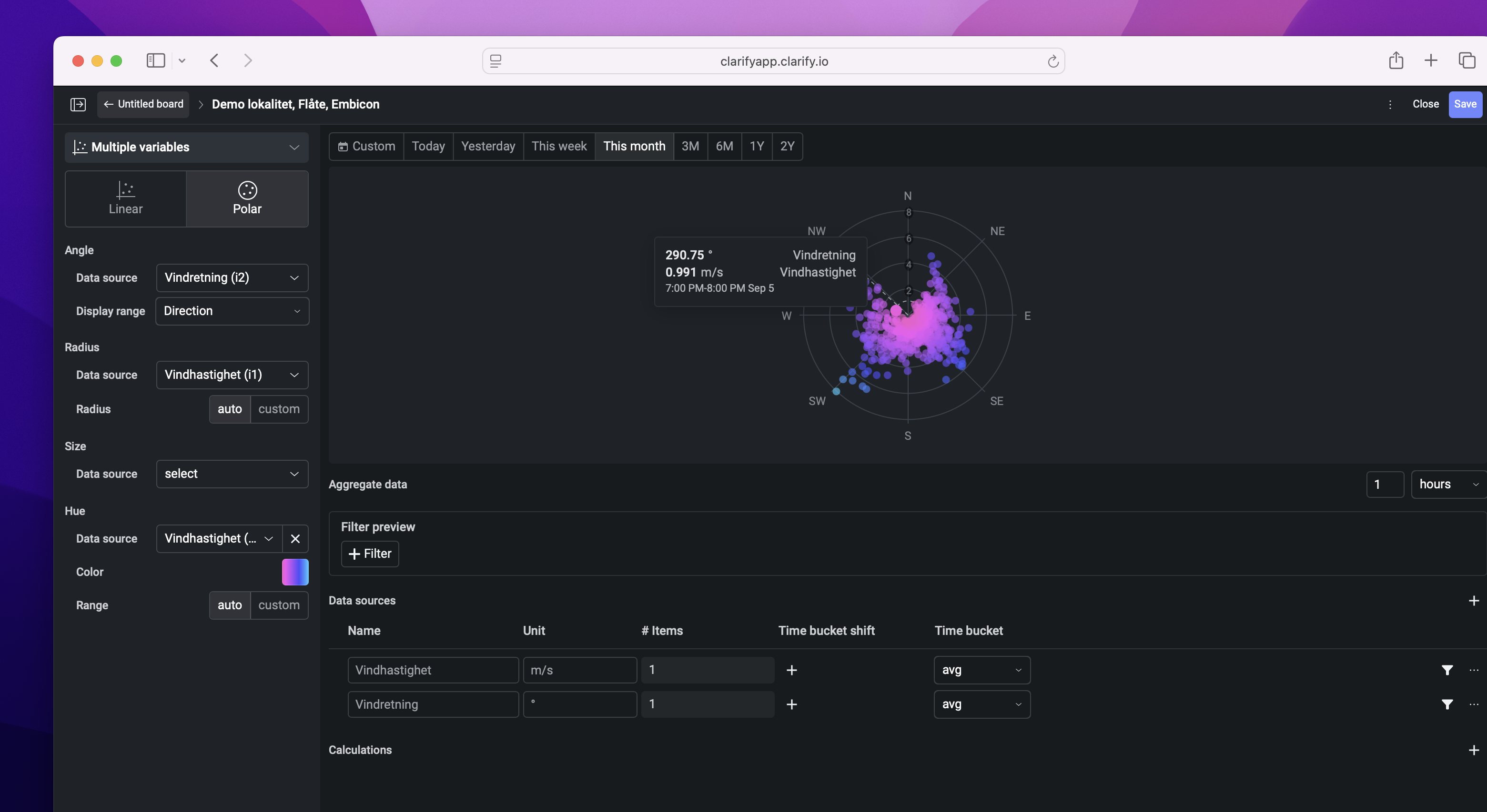
We also support visualizations in polar coordinates, allowing you to visualize for example the wind direction and strength in the same plot. Try it out in a board in your organization today!
It's been a while since we updated the changelog with entries for our mobile applications and a lot has happened! Check out the video below to see the brand new iPad app for iOS 26, adding support for multiple windows!
Line chart and bar-charts visualizations are now expandable. By expanding a time series visualization you can interact with the visualization and explore the data right inside the board.
Time shifted items are now supported in the statistic panel for Timelines.
Views in boards makes it possible to use a single board for different locations or assets with similar items.
Simply build the board using all applicable items and filter it down using label groups. Save the filters to views and simply switch between the views.
New aggregation methods are available for data sources in boards. Use the new “first” and “last” aggregation methods to get the first or last data point in the bucket.
Web client improvements.
We are introducing two new error codes to Clarify.
When a request is rate-limited, you now receive the new error code -32011 (Too many requests) instead of -32015 (Try again). This aims to allow clients to handle rate-limits in a more explicit manner.
When requesting an evaluation through clarify.evaluate, and the evaluation reference more than the allowed number of unique items, you now get the new error code -32022 (Too many items selected) instead of -32000 (Server error).
While these changes could break some code, these are changes that are explicitly allowed by our Versioning document. If you are negatively affected by this change, please let us know, so that we can take your experience into account for future patch releases.
See the V1.0 and V1.1 release notes for an overview of all changes.
New navigation. You'll now find My Library, Watchlist & Activity in the app tab bar.
My Library: You can now search for documents straight from My Library. You'll also find pinned documents and collections.
Watchlist: Select and find your favourite Items.
Activity: View and search the latest activities.
Updates to the Clarify Web Client.
Now you're able to quickly add your favourite data sources straight from the Home-tab.
Look for the "+"-icon and select which data source you want to add and create your list.
Faviourites can also be displayed in iOS Widgets.

Calculations bring "spreadsheet" like formulas, conditional logic and ad hoc analysis to Clarify Boards. Say goodbye to copy-pasting and manual input to stay up to date.
Unlike spreadsheets, Calculations let you easily construct your formula with visualized steps so that you are less likely get lost in complexity. Verify the validity of your calculation as you go.
You'll find most of the formulas you already know such as SUM, AVERAGE, COUNT, MIN, MAX, IF and many more. Combined with conditional logic you have the power to enrich your data like never before. It's time to move your spreadsheets to a better home.
Here's some use-cases we have already seen from our customers:
ESG reporting
CO2 emission calculations
Price-based calculations
Fuel and energy consumption
OEE
Production line uptime
Percentage of scrap pieces
Distribution
Daily distribution of machine running / not running / error
Predictions
Days left of material based on current consumption
Trigger notifications with the Clarify Evaluate API
Use no-code/low-code solutions to send messages to Microsoft Teams or similar when certain conditions happen
Check out our Board documentation for more details.


We are proud to announce that today we release the Clarify API v1.1. This notice is relevant for you if you integrate directly to our HTTP APIs. Updates to our Python and Go SDKs will arrive later.
Highlights
Here are the most important changes from the API v1.1beta2 release. For a full list of changes since API v1.0, please see our API release notes.
New clarify.evaluate method
The new method clarify.evaluate allows defining custom aliases for your item aggregations, as well as specifying time-shift (by a number of buckets) and evaluating math expressions similar to those previously exposed through calculated items.
Breaking changes since v1.1beta2
All RPC methods from API v1.1beta2 are available in API v1.1, but there are some minor braking changes. These changes will take effect for you if you do not set the X-API-Version header, or if you explicitly change the header value from "1.1beta2" to "1.1".
The parameter groupIncludedByType has been replaced by a new parameter format. This allows standardized formatting options for all methods that return a resource selection. This change is only relevant to SDK/API client developers as the parameter is not intended as an end-user configuration.
Deprecation of API 1.1beta1 and 1.1beta2
API v1.1beta1 and v1.1beta2 should now be considered deprecated and will only receive security updates.
Removal of the API v1.1beta1 and 1.1beta2 versions will be announced in advance, giving everyone a reasonable amount of time to update.
To improve the consistency in how operators work in calculated items, we are doing a breaking change to the result of additions (+) and subtractions (-) when either of the input values contain empty values. To allow backwards compatibility for existing use-cases we have added a new function sum that retain the old behavior. The sum function is available now, while the changes to +/- will go live on Friday August the 25th 2023. This should give you some time to apply manual migrations, if you require it.
Is this change relevant to me?
If you use the + (or -) to summarize items that can be empty for any given calculation bucket, you should use the new sum function to retain the old behavior.
We will change how + and - works when combining series that contain missing (empty) values. Before the breaking change goes live, we return a result for all time buckets where at least one of the input values contains a value. We do so by replacing the empty value with 0. This is different from how other operators work, such as * (multiplication) and / (division), which only return results when both inputs contain a value. After the change, addition and subtraction will — just like all the other operators — only return a result when both inputs contain a value.
Example
To better understand the change, consider a calculation where you want to return the difference between the inside and the outside temperature, and consider what would happen if either of the series are missing a value. We have illustrated this below.


Sometimes, you want to be able to summarize multiple series and return results, even for time buckets where one or more of the input values are empty. Before the breaking change, you will be able to do this using the + operator. However, if you want the calculation to work after the breaking change gets introduced, you must convert to using the sum function instead.
The sum function work by returning the sum of all non-empty inputs. I.e. sum(a, b, c) would work similar to how a + b + c worked before the breaking change.
Before you migrate your existing calculations, you should consider which results you really want, rather than the results you got in the past. If you need help to understand what's best for you, please do not hesitate to contact Support.
Below is a short table of how to produce backwards compatible sums, that is sums that return results even when one of the inputs are empty.
If you are calculating the diff of two items, and where smart enough to figure out that you could use ternary conditions to omit empty values, you can simplify your expression once the breaking changes go live. Note that you are note required to do this simplification, as the old expression will continue to give valid results.
For more calculation options, check out our reference documentation.
Today we're happy to announce the release of a no-code industrial dashboard in Clarify along with several other new features.
With Boards, you can enjoy hassle-free and highly customisable dashboards without vendor lock-in.
Would you like a personalised demo or more information? Request access here
Calculated items can now evaluate conditionals, allowing you to create powerful state evaluations from your data. You can read more about how to build your own conditional logic in our updated guides.

- New guides added for Kepserver and Teltonika TRB-XXX
- Updated Node-RED nodes
With this release we've added some new operators that you can use in your calculated items.
Learn more about how to do calculations based on your raw data from our guide.
- New formats supported for MQTT, Data frame and Kepserver.
- iOS application has an updated menu system
- Statistics is now supported for calculated items
After weeks of testing, we are happy to announce that our MQTT Broker interface is available to all customers. You can now connect any device or software with MQTT support to Clarify in order to start logging and visualizing data. Head on over to our documentation to get started!

With the release of our MQTT Broker interface also comes support for Sparkplug B. Compatible devices can now stream both data and meta-data directly into Clarify, significantly reducing the time and effort required to get started.

We just launched our new Golang SDK. Currently it only supports writing data to Clarify, but support for querying data is coming as well! Read more about it in our documentation or check out the Github repository.
When using the admin panel in Clarify there are some guides from our documentation that can be handy. We have now updated the headers in the admin panel to show relevant information, including links to documentation for the different menus. This means you can easily find guides for integration, item management and more when you need it the most.

We have heard from some of you that you have more labels than our item cards are able to show, and now we've fixed that. Labels shown on item cards will now be shown over multiple lines, allowing for larger label structures than before without losing sight of them!

Our documentation pages are growing a lot these days and to make it easier to navigate, we've completely redesigned the front-page to help you navigate it. If you are just getting started with Clarify, make sure you check out our user guides.
Ever wanted to add a label to multiple items, or wanted to fix a typo in the item name across twenty different items? Now you can! Simply select the items you want to edit, then choose one or even multiple operations to apply.
We've been working on our documentation pages for a while and we're happy to announce that they have now been officially released. Over the next weeks we'll be adding more content, updating the front-page with a fresh look and overall adding lots of nice improvements. Head on over to https://docs.clarify.io to check them out!

We've heard from some of you that supporting OAuth 2.0 client credentials in your integrations isn't always easy or even possible. That's why we've added the option to choose from either OAuth 2.0 or Basic authentication when connecting with our APIs. You can also have multiple credentials per integration now, making it possible to roll over credentials without any downtime.
Often when we're working with time-series data, we want to see how we are doing compared to some earlier time period. Time shift allows you to do just that. This feature has been long awaited and we're super happy to announce that time shift is now available for everyone!
Note: this feature is only available to customers on the business plan
Want to share data with another organization? You can do so now in an easy to use, safe and transparent way using Clarify datasets. Simply create a dataset from the admin panel, then choose the organization you want to share it with. You can add or remove items, or even revoke the dataset entirely at any time, giving you full control of who can access your data.
We've improved how a visualizations menu is shown in the timeline view. It's now easier to find the button to open the menu, as well as seeing if a visualization has a name or not.

The menu for configuring thresholds used to be available on both items and visualizations. This could lead to some confusing situations as there was no clear way to distinguish them on the graph. Now the setting is only available on visualizations, and the design of the settings menu has been improved to make it easier to set color and name.

This feature was added a while back but hasn't been properly announced until now. For longer timelines, it can sometimes be hard to navigate vertically. Now, instead of scrolling through the timeline, you can open the right-hand navigation menu and click the name of a visualization to jump to it. The timeline will scroll to the correct position and even flash the name of the visualization you clicked to make it easy to spot!